Highlights from UXScotland 2013
I was delighted to attend the very first UXScotland last month. The conference was run over two days and featured some brilliant speakers, including the lean UX hero Jeff Gothelf, my now-famous-ex-boss Giles Colborne, the sublime Mike Atherton and the charming Chui Chui Tan. And me, (but I’m not nearly as cool as the others).
UXScotland highlights:
Let me start by saying this is not an exhaustive list – just the highlights from the sessions I attended.
Jeff Gothelf: Better Product Definition with Lean UX & Design Thinking

Jeff lead an interesting keynote about lean UX, which he defines as:
“Inspired by Lean Startup and Agile development theories, it’s the practice of bringing the true nature of a product to light faster, in a collaborative, cross-functional way with less emphasis on deliverables and greater focus on a shared understanding of the actual experience being designed.”
– Jeff Gothelf
The key take away for me was the idea that requirements are assumptions, and once they are declared as assumptions, they can be explored and tested as hypothesis’ more openly with clients/teams. I want to explore this at the start of my next project, and see how working with a set of hypothesis’ could change the dynamic of my work.
Graham Odds: The Mind’s Eye: How We Perceive Data

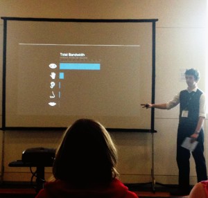
Graham presented some interesting points about how data is perceived, and how fast visual information is processed by the brain compared to our other senses. He also covered some points relating to the speed and accuracy we are able to make sense of data, and how using different methods of displaying information can have a big impact on our ability to effectively judge whats being shown.
The most interesting slide in my opinion is the one which shows the most effective visual attributes to communicate values: quantitative visual attributes.
His full presentation can be viewed on GitHub.
Oli Shaw: Strategic Design Tools – Patterns, Frameworks and Principals

I found Oli’s talk to be thought provoking and offered some good ideas about strategic design tools, and like Jeff’s session earlier in the day, he preached the gospel that:
“Hypotheses beat requirements which beats solutions any day of the week”
– Oli Shaw
Another practical tip Oli suggested was taking a mission statement, converting it into an elevator pitch and finally condensing it into a tweet. The process of reducing the volume of words used simultaneously focusses the strategy. Neat.
Oli’s presentation can be viewed on SlideShare: Strategic Design Tools – Patterns, Frameworks and Principals.
Mike Atherton: Brand-driven design

I loved Mike’s entertaining talk about brands, and the role they play within design. Branding is a constant, yet often peripheral part of the UX workflow (dare I say that?!), but really, they are part of the heart of the experience for users, and this goes beyond logo recognition. The concept of a brand needs to be more than just its visual presence, it has to promise the user something unique and differentiated within the marketplace, in short as Mike puts it:
“A brand is an idea you stand for, made real by what you do and expressed through your personality”
– Mike Atherton
You can view Mike’s full presentation on SlideShare: Brand-Driven Design.
My session: Make your first UX Comic or Storyboard
I have already written a little about my session: How to make your first UX comic – UX Scotland slides. I had fun, and I think the people that took part did too, judging by all the comics that were created!
Food and booze
Of course, one of the main reasons for going to conferences is the free food and booze, and UXScotland didn’t disappoint with these. The free booze was particularly good, and was provided at the Voo Doo Rooms in Edinburgh, along with a curry buffet. It was a great setting to mix with the other delegates and have a proper gossip about UX stuff.
More about UX Scotland
Lots more about the conference can be found on the UX Scotland Lanyrd page.